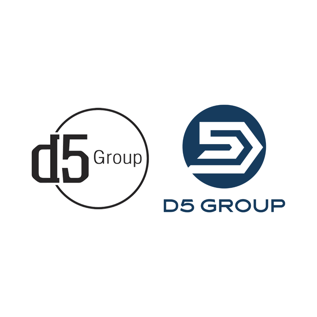
I remember the timeframe vividly. I had sent in my paperwork to the Ohio Secretary of State online portal in February 2014. The D5 Group was officially registered. While other paperwork needed filing, I was excited about something else: the official logo.
The first D5 Group logo fit perfectly - a "d" representing my "Five D's", the number 5 (important people to me) inside the circle with the the word group (team). The circle representing my loyalty and commitment to everything within it.
The logo had a non-traditional look. The name of the d &5 font was Collegiant. At the time, it represented us well - passionate and non-conforming. Our colors had their purpose too.
Black and white. Enigmatic, powerful, applicable, not flashy, loved - that's why I chose those colors. Not to mention, they look great on clothing and websites. But time and experiences will bring change.
In 2021, life was not good for my family. Good for business, not life overall. I took some time away from the company, a long time. In the fall of 2023, I began to get back into the groove gradually. But while off for that time, much thinking occurred. Not just grief, but business decisions. On the latter, it was time for a change.
Let's fast forward to June of this year. I commissioned an excellent designer to redesign our logo. She listened to my history and reasoning and produced an incredible logo. A month later, I changed our color scheme.
Yes, for nearly a decade, our brand identity has carried us through growth, partnerships, and milestones. It has been a familiar marker of who we are and how we work. But change was needed.
As of August 1, we fully implemented the refreshed identity: a new logo, a modern font, and a color palette of Executive Blue, Foundation Grey, Clarity Teal, and Communication White.
The logo and its change signify our growth, boldness, and abstract swag. It closes the circle and brings forward movement, a sharp focus, and intention.
As for our color scheme:
Executive Blue: Authority and calm competence
Foundation Grey: Balance and grounding
Clarity Teal: Balanced solutions
Communication White: Clean contrast of focus
Something that has not changed is our commitment to excellence, collaboration, and delivering results for our clients and communities.
We look forward to sharing this next chapter with you.
D. Lee Scott
Chief Executive Officer